Restaurants: Behind The Scenes — AvroKO – A Partner’s Perspective
To make good on our promise to put the team into the restaurant and introduce you to the designers, architects and planners that make it all happen, from demolition day to opening night:
Welcome to the first of our Restaurants: Behind the Scenes series as we chat with Adam Farmerie, one of the partner’s at the New York City dazzler of a design firm, AvroKO.
AvroKO is a design firm that has a glorious reputation for creating a dramatic wonderland of restaurants, bars and hotels. They have been praised by the media, recognized with numerous design awards; and applauded by an adoring PUBLIC. Their artillery – a moving van full of competencies that begin with sublime concepts, which, by their very nature, are always in hot pursuit of AvroKO’s design, graphics and custom furniture.
With offices in NYC, Nolita, Hong Kong and Bangkok, the four partners: William Harris, Greg Bradshaw, Kristina O’Neal and Adam Farmerie are able to expand their design purview as evidenced by stunners such as Beauty & Essex, The Stanton Social and PUBLIC in New York to the Hurricane Club and Lily and Bloom in Hong Kong.
Although this NYC design team possesses a coveted array of talents that place their firm, AvroKO, into the “distinct-from-others” category, these individual and collective talents can only be realized and understood by viewing the work and conversing with a few of the wizards behind the curtain. Now it is for you to discover the core operating system behind their design principles and processes.
AvroKO – A Partner’s Perspective
What experiences or influences drove the formation of AvroKO?
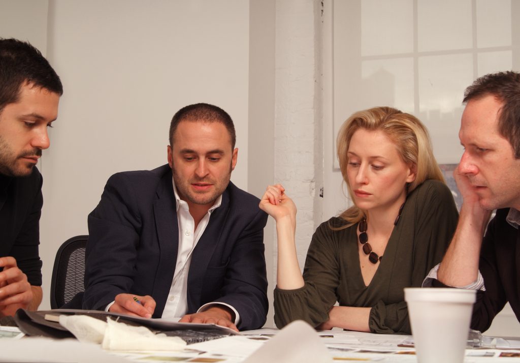
Adam Farmerie: Greg Bradshaw and I were studying architecture at Carnegie Mellon but had previously met in 1990. Also at Carnegie Mellon, Bill was studying painting and Kristina was focusing on more conceptual art. We all knew each other socially, but together, we also worked a bit on each other’s projects, so we had an interesting relationship even back then. If Bill had an art project that he was working on, we would go to his studio and play around with what he was doing and throw some ideas out there, and the same would happen with Greg and Kristina. I was just always this oddly fluid relationship. Because the architecture department and the arts department were all in the College of Fine Arts, and our studies were in similar buildings, we had an easy way of crossing paths.
Fast-forward about 8 years later, we had all graduated and Greg and I had found ourselves in New York City working for other architects. Bill and Kristina had found themselves in Seattle, Bill was working for an interior designer at the time, and Kristina was working for the Seattle Museum of Art. Greg and I decided independently to create our own architecture and design firm called Avro Design. At the same time, in Seattle, Kristina and Bill had started a graphic design, branding and concept design firm called Ko Media Studios, which they eventually moved to New York.
We all reconnected socially in New York, and then one day, Bill and I had a client that we were doing architectural work for that needed some graphic design services. We quickly rediscovered that same enjoyment that we had experienced working together at Carnegie Mellon. Regardless of the fact that it wasn’t appropriate for an architect to be working on a bit of graphic design or appropriate for a trained artist to be playing around with some of our architectural or interior stuff, we realized that the collaboration and the synergy that we had amongst the four of us was very real. I was appealing because it was extremely cross-disciplinary in a natural way. We said, “hey, you know, your peanut butter is already in my chocolate, let’s just stir the pot a little” so we just made it official and combined our firms in 2002, and that is why the firm is named AvroKO.
The firm’s name, AvroKO works. It’s particularly apropos of your brand, I think, because it’s a little exotic. It’s a little curious.
Adam Farmerie: It’s curious for sure. One of the other things that came out of this collaboration was that we had already decided that this firm was okay to operate using a number of different mediums, however, it needed, to create projects in which the concept would undoubtedly come first. We would figure out what that was and then we would allow it to filter down through whatever mediums necessary in order to make that exceptionally strong. It seemed that the hospitality industry was a project and client type that would suit us.
What aspects of restaurant design are intriguing or more challenging than other types of projects?
Adam Farmerie: Well, I think a number of reasons having to do with our interest in restaurants and hotels. Also, they are the types of projects that seem to allow a number of different disciplines to come together under one roof. Restaurants owners want you to push the limit. If they are going to do a Chinese restaurant, we present a concept based on the lost city of Kowloon and play on those exotic environments. Someone may not want to live in an environment like that, but they certainly would want a restaurant like that, because there’s a little bit of theater that happens. Also, we might get to do a little furniture design, graphic design, or industrial design. Restaurant and hospitality projects tend to be vehicles in which you can push concepts a bit more freely than a residential project.
Concepts tend to be at the core of our interest level. Developing intriguing concepts and researching them, and allowing ourselves to be obsessed with them, and then letting that take over and run the direction and decisions on certain projects. Hospitality projects tend to be rife for that.
How do you go about developing a concept? Is there a collaborative process between the partners at each stage?
Adam Farmerie: It tends to be based on who the client is, what they’re going for, where the project is. So we start by saying, “Well, this project has a client who wants to create a Japanese restaurant.” We all, individually and sometimes collectively, are reading about and/or obsessing about different subjects in history or life in general. We share those kinds of obsessions with each other and sometimes that spurs another obsession.
How might that translate to the development of the design elements?
Adam Farmerie: Sometimes it is travel based. One or several of us will find or see something and think that it would be a fascinating concept to explore for a project. For example, there was a client of ours that came to us, and they wanted to do a project on the lower East Side, which gave us an opportunity to study the history of the lower East Side of New York City. As we explored the history of the lower East Side, we found that, in the early 1900’s, it was the center for haberdashery – tailors and dressmakers. We enjoyed having this piece of history that we could mine for inspiration for what would become The Stanton Social. It led us to the development of the decorative motifs for the spaces, as well as the approach we used to put things together, which was based on old clothing construction methods.
We were collectively traveling in Amsterdam, and we started to develop this idea centered on the Dutch shipping industry in the 1600’s. As we researched the Dutch shipping industry, those types of things would start to impart themselves into the project. That project never got built, but that was another example of how our process works.
Give me an example of an element born of this process and philosophy.
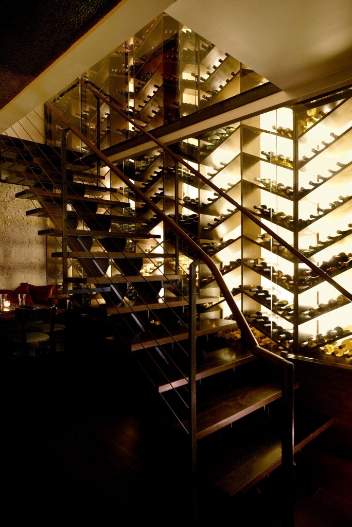
Adam Farmerie: For The Stanton Social project, we ended up pulling out this idea of a herringbone design and ended up making a wine rack in the back of the space that was a blown-up herringbone pattern.
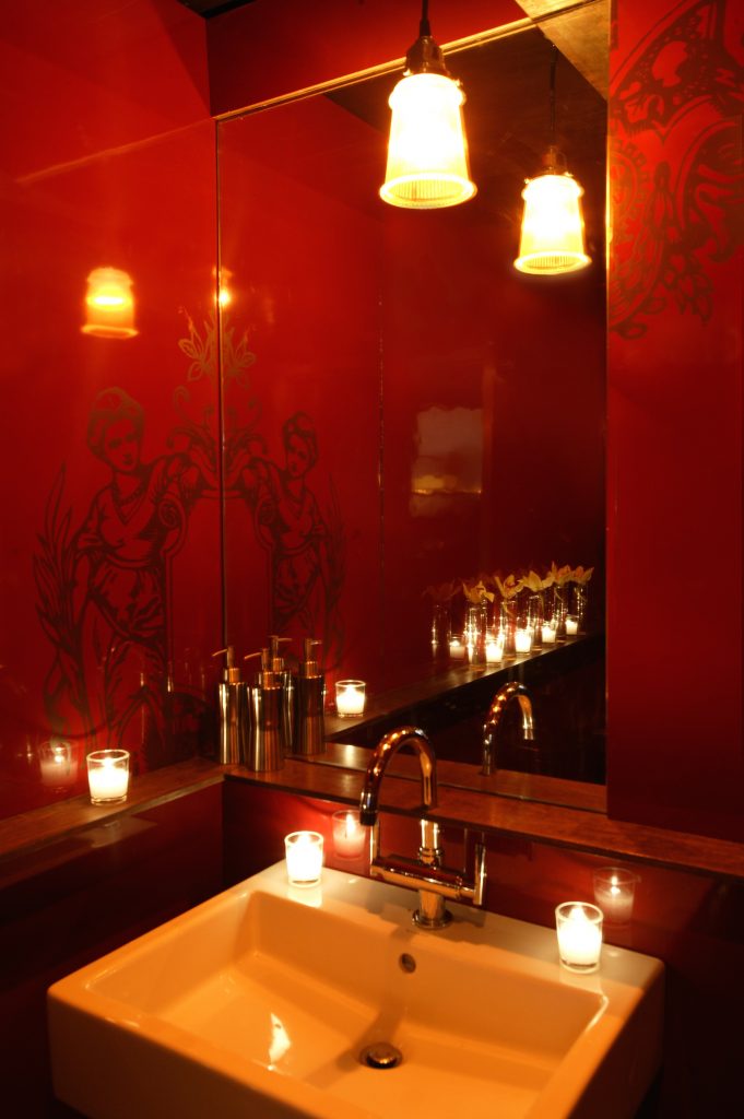
The stitching details on some of the banquettes were similar to the contrasting stitch details that we found inside of men’s jackets from the period. All the jackets and dresses had these lovely little silk labels. We utilized these labels several places in the restaurant. We sewed the gorgeous little silk labels that we designed, on the staff uniforms. When we blew one of the labels up to a large-scale format, it began to lose its identity. They became unusual wall panels used in the bathroom.
How do you think those details translate to the diner? They might not understand the historical background, but they do see something intriguing and it may affect them emotionally.
Adam Farmerie: They have this innate inner ease that may psychologically connect to some story or some era. Some things that make people feel a certain way. That is powerful stuff.
We tend to think there are some concepts that people can relate to more than others. PUBLIC Restaurant is a perfect example. We developed a concept around the collective spirit that was a part of the Works Progress Administration tasked with getting people back to work. There was a collective spirit of “Yes, we can do this together.” There was an innocence, as well as nostalgia for that era of collective good that we wanted to tap into.
When you designed PUBLIC, what elements did you employ that are representative of that era?
Adam Farmerie: The forms of some of the lighting fixtures are literally from 1940’s laboratories. I think people may have seen these in textbooks when they were younger or they might have experienced them firsthand. You don’t think, “Oh, those are 1940’s light fixtures”, but they are evocative of another time and another space. Maybe a simpler time, a slightly more innocent time, and that puts you at ease and connects you to an era that you have nostalgia for. Hopefully it translates to nostalgia for this restaurant.
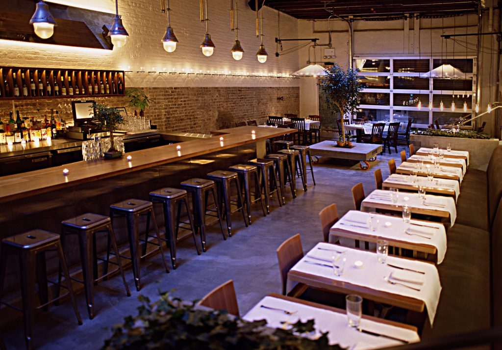
PUBLIC has an intriguing juxtaposition of warm, cozy, textures and feeling with industrial hard edge elements: garage door, exposed ceiling, and brick walls. It’s a combination that works.
Adam Farmerie: Yes, it is the juxtaposition, isn’t it? I think a lot of our work does prefer utilizing existing structures and that juxtaposing a modernism to an existing structure.
Is that a part of the AvroKO signature to retain a degree of the character of these old buildings?
Adam Farmerie: When we can, that’s one of the things we enjoy because you already have a bit of history on your side: historical eras, stories and/or people.
How would you classify or describe your design style(s)?
Adam Farmerie: I think I would just say that it is heavily concept based. I think if you look through our work, clearly, there is a modernist thread to it, so we tend not to replicate historical things. We tend to use them to inspire us to create new forms that we normally wouldn’t make, and so I think that’s why it is concept-based.
There is a whimsical aspect that streams through AvroKO’s projects that make one feel transported or swept away to another world.
Adam Farmerie: I think you’re on to something. I think transformative is something that we would aspire to. You know, that you would have a transformative experience, and we’re using historical narratives to help create that.
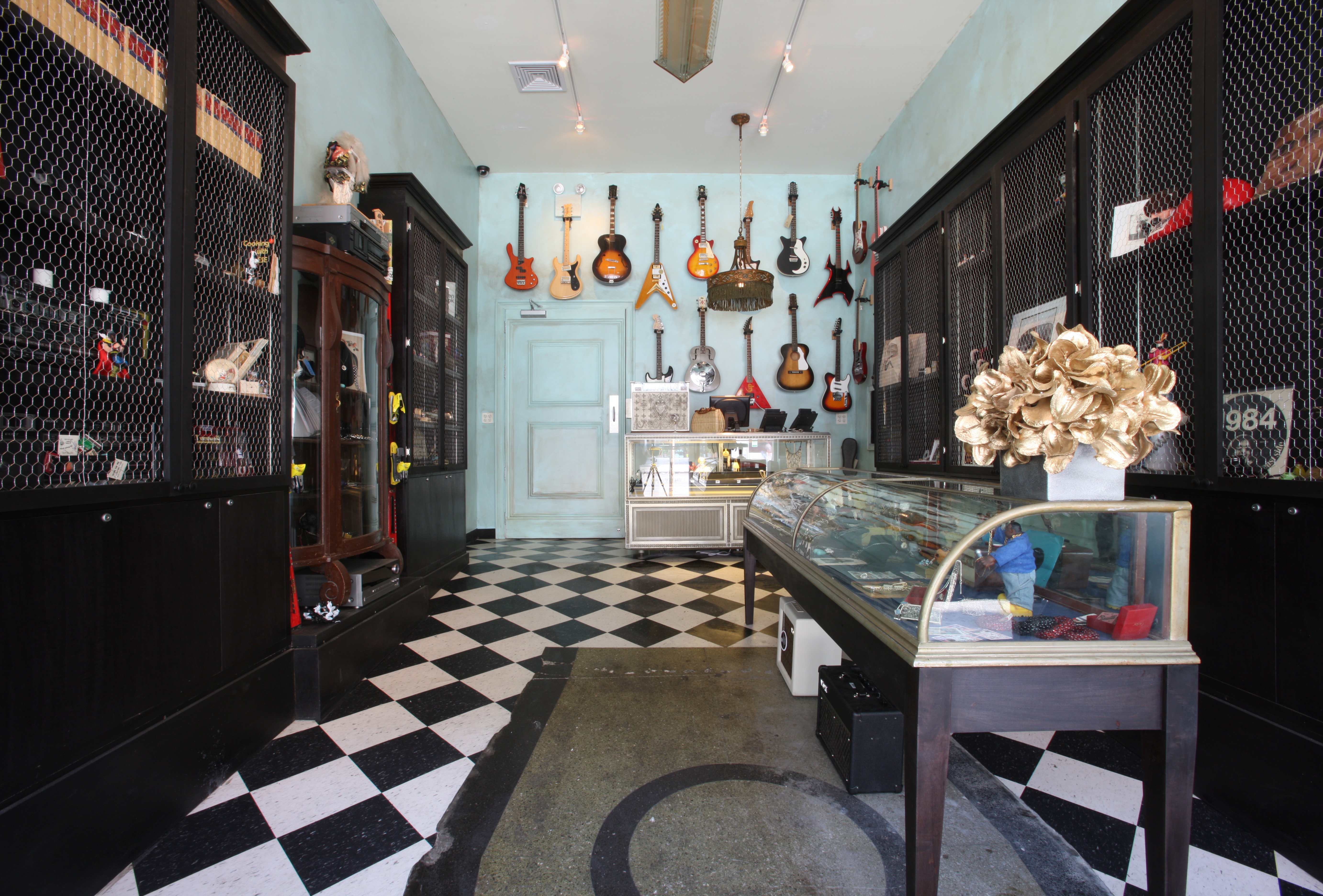
Beauty & Essex, with all the guitars displayed on a pastel wall in the entrance shop and jewelry-like representations throughout the restaurant; what part did the owner play in developing the concept and what part did you play?
Adam Farmerie: They wanted something different out of that space. We came to them with the concept that we were going to explore the Lower East Side historically and the narrative of the haberdashery in the 1920’s and 1930’s. It would be somewhere between old jewelry department stores, concentrated in the lower East Side of New York until they moved to midtown, and the luxurious living rooms and apartments of the wealthy; like a big blown-up opulent residence that transformed into a department store.
Does that concept carry over to the Beauty & Essex name inspiration?
Adam Farmerie: Well, Essex is just where it is – Essex Street. They started with the idea of Beauty & Essex, so we began thinking to ourselves, what is the beauty function and how can we connect it. In our minds, it was partly the notion of opulence and how opulence would have felt back in the 20’s or 30’s.
Taking into consideration all your projects thus far, what are the design elements that you have employed whose combination surprised you?
Adam Farmerie: Well, its funny, we were talking about both The Stanton Social and Beauty & Essex. At The Stanton Social, on the second floor, is the lounge space where we wanted to block out all the walls, so we designed a series of screens.
Are they backlit?
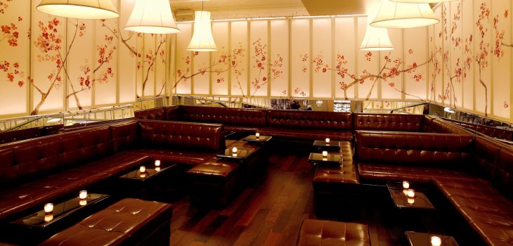
Adam Farmerie: They are a little bit backlit. Both by lights, as well as by the windows in the front, and are based on an old image we found of an early 1900’s woman’s dressing screen with a Japanese motif. We just blew it out over the whole room. We designed the light fixtures using the framework of a woman’s dress and just stretched some muslin over the shape. We pushed ourselves to develop the overall direction. What, are we going to paint the walls green? Are we going to make them wood?
Again, it is such an extraordinary combination. I see it as a floating room. The top portion of the room is light and ethereal and delicate, and the bottom portion is an anchor of rich color and texture.
Adam Farmerie: Yes, it is a fantastic space. I mean that is one of my favorite spaces. My partner, Greg, headed up that particular project. The four of us work on projects together, but then, in order push them through, one or two of us will pair up and take the lead, and the other two, whoever isn’t taking the lead, just join in as part of the concept development. Thereafter we meet every couple of months to sort of play along.
If you enjoyed this installment, you’re in luck. We have another AvroKO – A Partner’s Perspective conversation with Kristina O’Neal coming soon.
In the meantime, read more about some of AvroKO’s historically inspired designs: www.avroko.com

